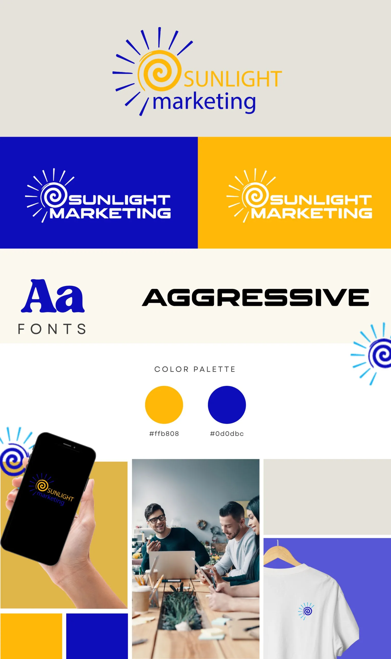
This version of the Sunlight Marketing logo features a more abstract and energetic design, incorporating a spiral sun symbol to represent warmth, creativity, and dynamic energy. The spiral, drawn in a vibrant golden-yellow, suggests continuous growth and innovation, while the radiant lines emanating from the sun symbolize expansion and the spread of bright ideas.
The typography uses a clear and modern font, with "Sunlight" in golden-yellow to reinforce the vitality of the sun, and "marketing" in deep blue to convey trust, professionalism, and stability. The contrast between these colors creates a visually striking balance, highlighting the company’s focus on both creativity and strategic planning.
This logo effectively captures the essence of Sunlight Marketing as a forward-thinking company, combining innovation with reliability to offer impactful marketing solutions.
- Categories
- AllBRANDING
- Tags
- E-commerce


