Project Overview
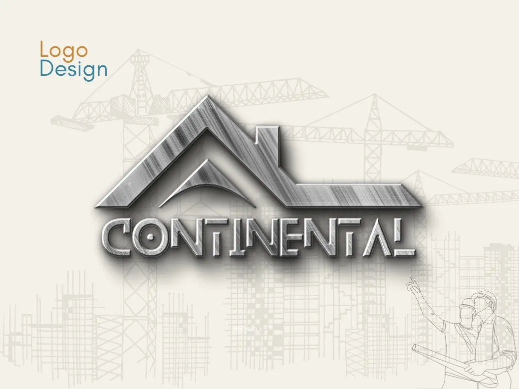
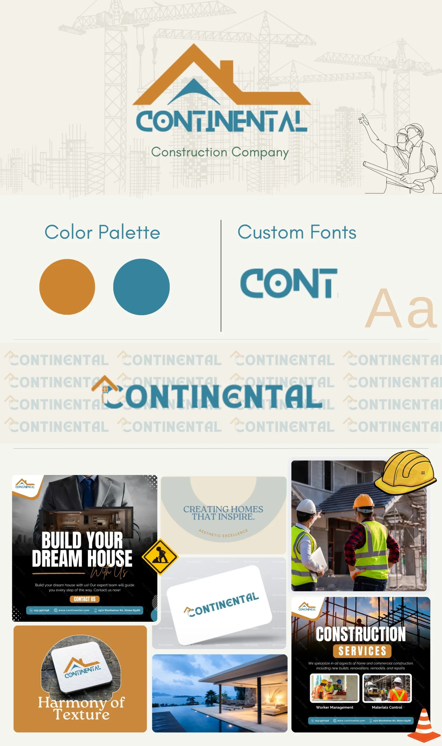
I had the privilege of designing a complete brand identity for Continental Construction Company, a forward-thinking construction firm dedicated to building dream homes and modern structures with precision and reliability. The project aimed to create a visual identity that reflects professionalism, trust, and innovative solutions in the construction industry.
Brand Highlights
- Logo Design: The logo combines the silhouette of a roof to symbolize construction and a solid, modern typeface to emphasize strength and stability. The sharp angles and clean lines align with the company's commitment to precision and excellence.
- Color Palette:
- Warm Orange: Represents energy, creativity, and the passion for bringing visions to life.
- Teal Blue: conveys trust, professionalism, and reliability.
- Typography: A custom font was developed to give the brand a unique identity. Its bold and structured design represents durability and modernity.
What Makes This Design Stand Out?
The design showcases a balance between the company's practical roots in construction and its creative vision for crafting modern, inspiring spaces. The integration of illustrative elements like workers, tools, and helmets creates an immediate association with the construction industry, making the branding both recognizable and relatable.